
The car industry’s screen obsession is running out of road as physical buttons make a comeback
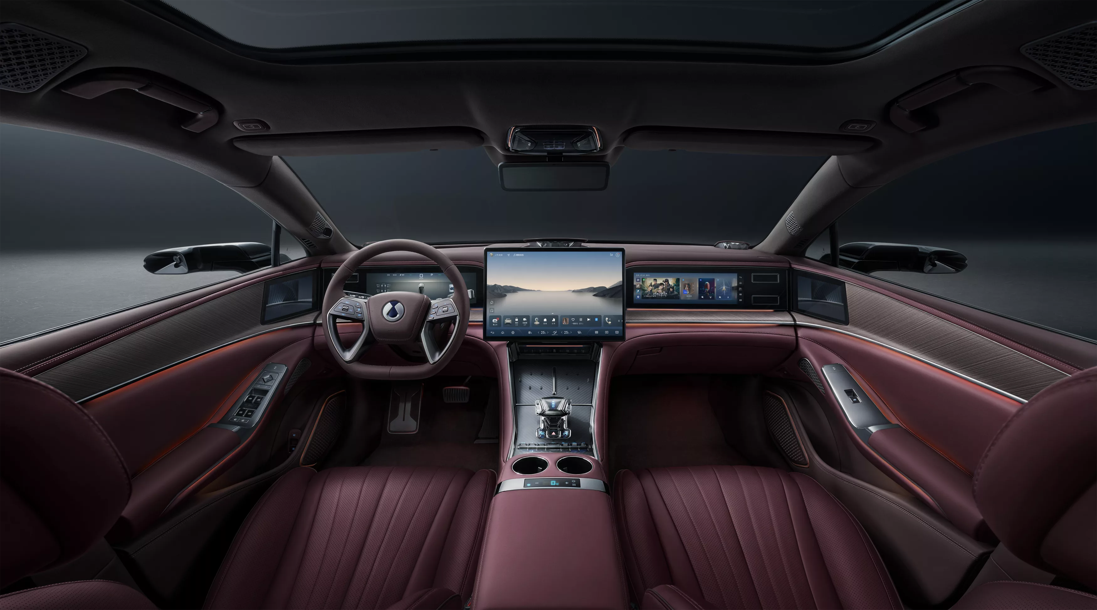
Just a few years ago, the evolution of the car interior seemed simple: fewer buttons and more screens meant a more modern car. Now that formula is starting to unravel. Owner feedback shows that some digital equipment offers little real value, Euro NCAP is paying greater attention to the usability of controls, and manufacturers are rediscovering one uncomfortably old truth: a car’s user interface must work above all while driving, not simply look good in the showroom.
Screens did not take over the car purely for aesthetics
The automotive industry’s shift to touchscreens was not merely the result of designers collectively becoming enamoured with tablets. There was a very clear industrial logic behind it. A traditional dashboard requires numerous physical switches, their mountings, wiring and separate control modules. Each model and trim level may require different components. One large screen makes it possible to move a large share of these functions into software.
This gives the manufacturer several advantages. The same hardware can be used across different models, menu functions can be changed through software updates, and optional equipment can even be activated after the car has been sold. At the same time, a large screen gives the interior a visually modern appearance.
Tesla showed how far this principle could be taken. The Model 3 effectively turned the large central display into the control centre for the entire car, and competitors quickly followed.
A full-scale screen arms race soon began in the premium segment. One screen became two, two became three, and eventually the glass surface stretched across almost the entire dashboard. It all made sense for the manufacturer, but the problem emerged on the user side.
The human finger has not become more precise through a software update
A touchscreen works brilliantly in a smartphone because the user holds the device in their hand and looks at it while using it. In a car, the situation is the opposite. The driver’s primary task is to watch the road. The car is moving, the suspension is working, the body is swaying, and a finger has to hit a relatively small area on the screen. If the same function is on a physical rotary control, the driver can commit its location to muscle memory.
This is the touchscreen’s greatest ergonomic drawback. A glass surface offers no physical reference point. The driver must first find the screen, then the correct menu, then the icon, and finally check whether the touch registered. Every step takes attention away from the road.
That does not mean touchscreens are bad in cars. On the contrary, they are ideally suited to navigation, media, trip-computer functions, energy-use graphs and settings that are changed infrequently. The problem begins when a manufacturer moves a function there simply because it can.
Climate-control temperature, window heating, volume or frequently used driver-assistance controls do not become better merely because a neat animation appears on a screen instead of a physical switch.
J.D. Power results show where the limit lies
This contradiction is clearly illustrated by J.D. Power’s 2026 U.S. Tech Experience Index. The study covered 68,084 owners of new 2026 model-year vehicles and examined 40 different automotive technologies.
The most telling finding concerns the dedicated passenger display.
Thirty-five per cent of owners of cars with such a display had not used it at all during the first 90 days. Only six per cent of respondents said the passenger used the display on every journey. At the same time, J.D. Power recorded 21.3 problems per 100 vehicles with this solution.
These figures do not prove that people hate screens. They show something more uncomfortable for carmakers: expensive, visible technology can be almost worthless to the customer.
The passenger display is the perfect example of this phenomenon.
It looks excellent in a promotional photograph. It allows a manufacturer to talk about a digital cabin. It raises the perceived level of technology. But if one-third of owners do not even use it, a legitimate question arises: whose problem does this component solve?
Good automotive technology tends to be boring
The most important message from the J.D. Power study is not really about screens. It is more interesting to look at what technology users actually like.
Highly rated solutions are those that do their job without demanding the driver’s attention. A smart start system, for example, generated just 2.4 problems per 100 vehicles. Owners also rated automatic climate control and systems that remember user preferences highly.
These are not necessarily the technologies a car salesperson demonstrates first.
That is precisely where their strength lies.
The best automotive technology does not require constant interaction from the driver. It reduces the need for interaction.
Automatic climate control maintains the temperature. A memory seat finds the right position. A keyless system unlocks the door. Properly configured automatic lights do their job without the driver having to control them through a menu on every journey. The less the driver has to think about a system, the better it usually works.
This principle contrasts sharply with consumer electronics, where user attention can be part of a product’s value. In a car, attention is a limited resource.
A large screen is not premium; good ergonomics are
The spread of screens created another strange situation. Once, the quality of physical controls distinguished an expensive car from a cheap one.
A good rotary control moved precisely. The resistance of a switch was carefully selected. The shape of the buttons made it possible to distinguish them in the dark. Designing and producing such a user interface cost money.
The touchscreen turned that hierarchy upside down. A cheap car and an expensive car can now have essentially the same-shaped glass surface. The difference lies in screen size, resolution, animations and software speed.
This allows a manufacturer to create a visually technological interior with relatively low component costs.
The rapid development of Chinese electric cars has made this especially visible. A large central display, digital instrument cluster and separate passenger display already give a mid-range car the visual equipment that was associated with luxury cars only a few years ago.
European premium brands responded with the same weapon.
The result is paradoxical. If everyone has a large screen, a large screen no longer says anything. The next competitive advantage may therefore be usability instead.
Euro NCAP makes ergonomics a safety issue
In Europe, consumer satisfaction is joined by an even more important pressure.
Euro NCAP changed its assessment protocol from 2026 and now pays greater attention to how the driver interacts with the car. Among other things, the organisation assesses the placement of controls, the visibility of important information and the effect of the user interface on distraction.
This does not mean banning touchscreens or requiring every function to have a physical button.
Carmakers will have to start proving that a digital solution is not merely cheaper or more dramatic, but also reasonably usable while driving.
The Euro NCAP 2026 protocol even sets requirements for the dimensions of touch areas. The touch area of a digital control must be at least 10 x 10 mm, and there must generally be sufficient space between areas to prevent accidental inputs.
That may seem like a trivial detail until you try to hit a small screen icon on a bumpy road.
Then 10 millimetres becomes a very practical unit of measurement.
Physical buttons are returning because the task has not changed
It would be easy to conclude from this that the automotive industry is returning to dashboards filled with buttons.
Hardly.
A screen can display vastly more information than a traditional control panel, and with electric cars and complex driver-assistance systems, a fully analogue cabin is no longer realistic. Instead, a new balance is beginning to emerge.
Infrequently used settings will remain on the screen. Navigation and media will remain on the screen. Electric-car energy information will remain on the screen.
Frequently used functions, however, will move back to where they perhaps should never have left.
A physical rotary control can operate temperature and volume. A steering-wheel button can activate a driver-assistance system. The hazard-light switch must be immediately easy to find. This is not a technological step backwards. It is engineering.
Carmakers measured the wrong thing for too long
The biggest mistake of the screen era was not adopting the touchscreen. It was the assumption that digitalisation has value in itself. Value only arises when technology makes the car better.
If a screen enables excellent navigation, it is useful. If software can improve a car’s functions over the years, it is useful. If a well-designed user interface reduces the number of physical switches without harming usability, that is useful too.
But if a driver has to open a menu to turn off the seat heating, that is not innovation but a poorly designed user interface.
The J.D. Power results offer manufacturers a fairly clear hint. Customers do not necessarily want less technology. They want less technology that they have to fight with.
This is especially important in the European market. Chinese manufacturers can offer ever more digital equipment at ever lower prices. There is little point in European manufacturers responding with simply an even bigger screen.
They have to do something harder: build a better car.
And in the cabin of the next decade, the measure of that may not be the screen diagonal, but how rarely the driver needs to touch it at all.


