
Vauxhall simplifies its 167-year-old griffin
 1/7
1/7
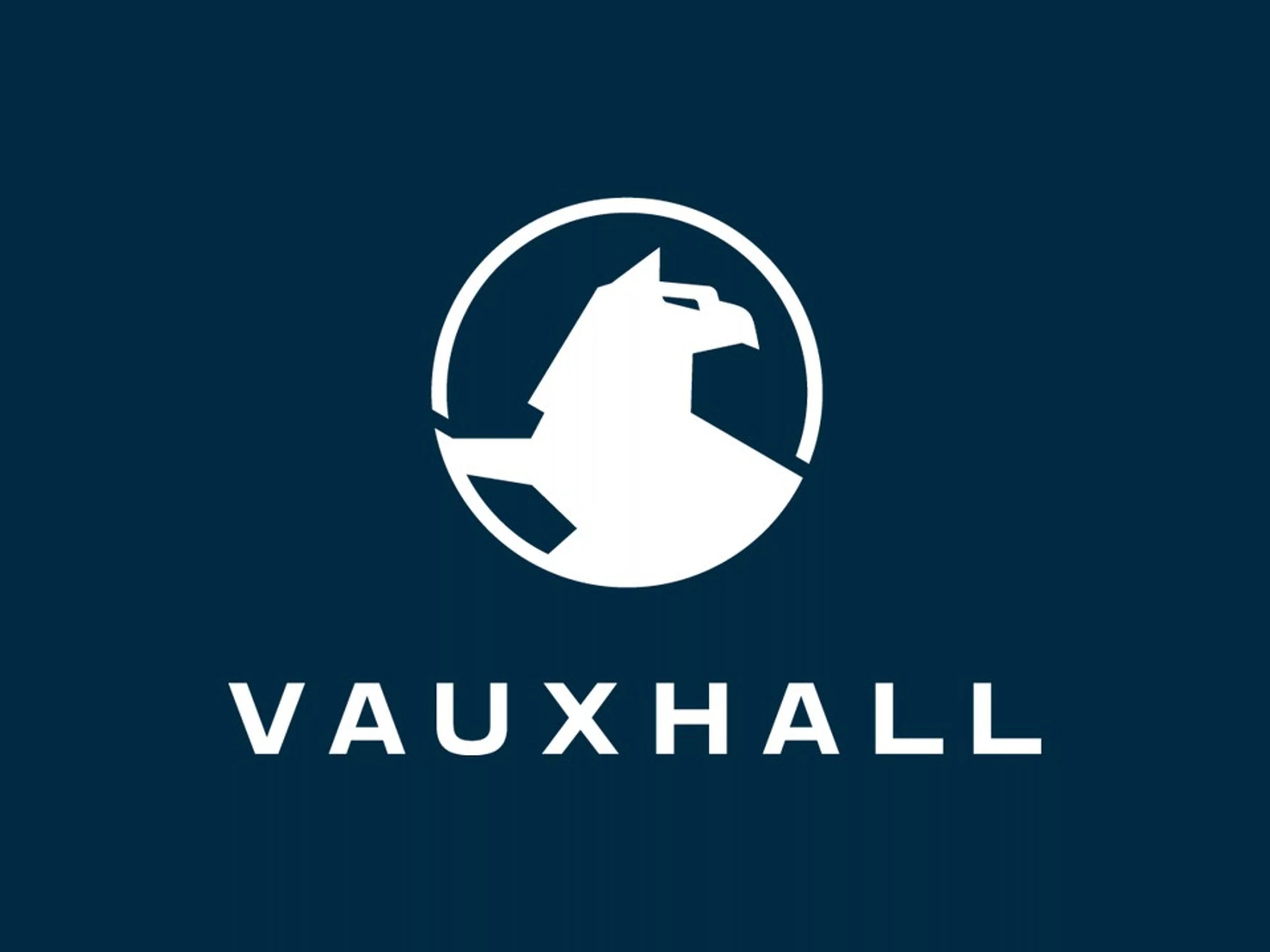
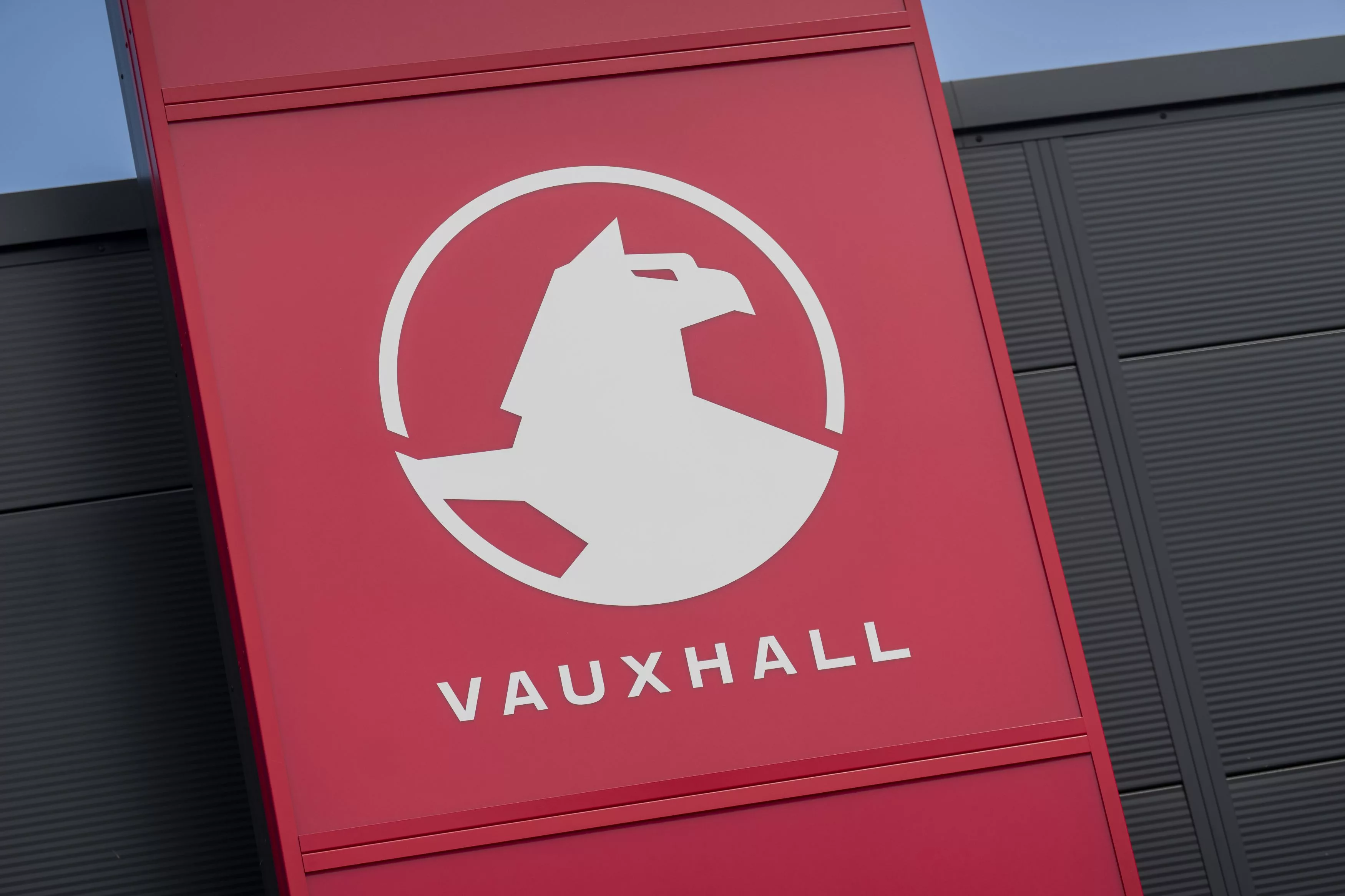
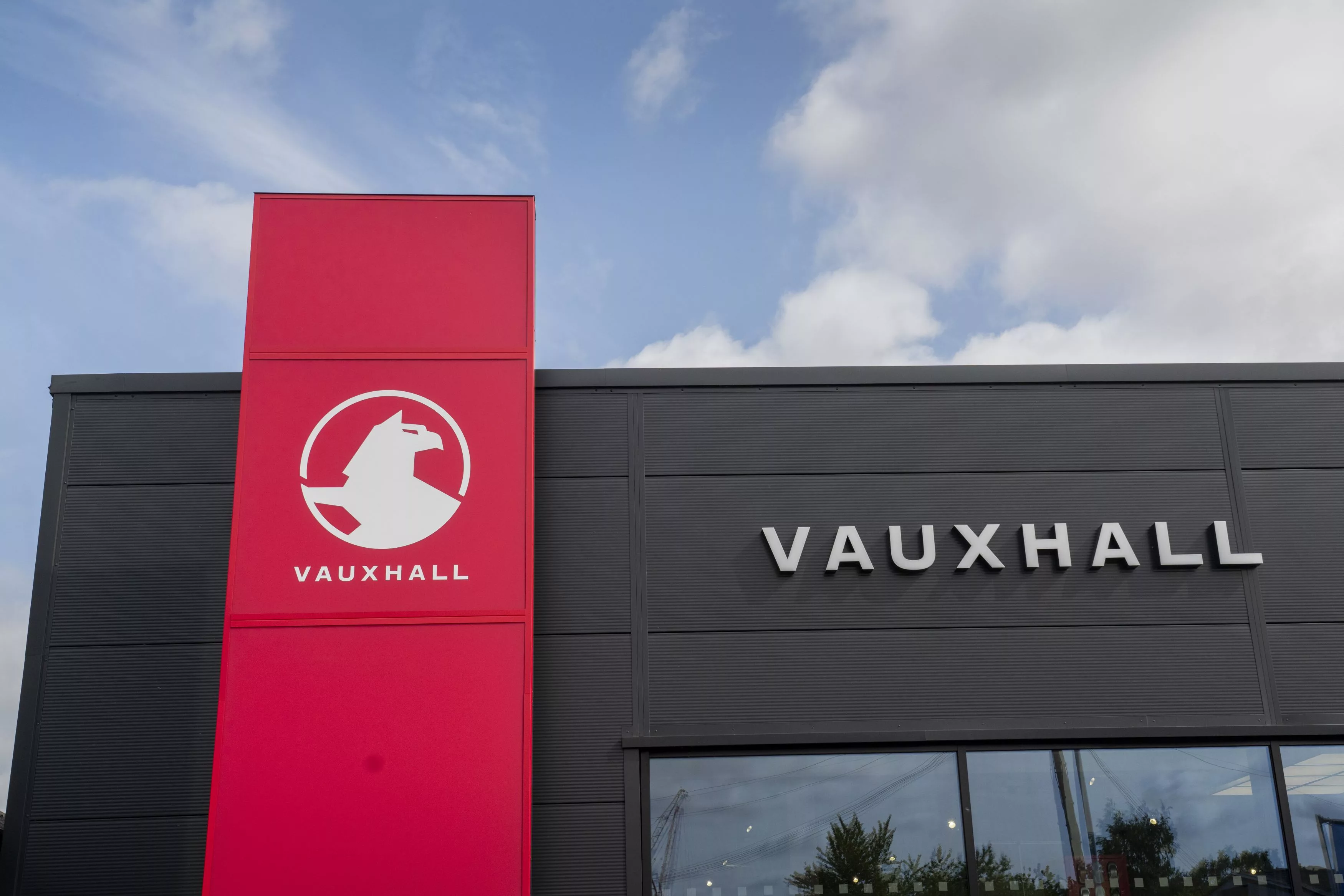
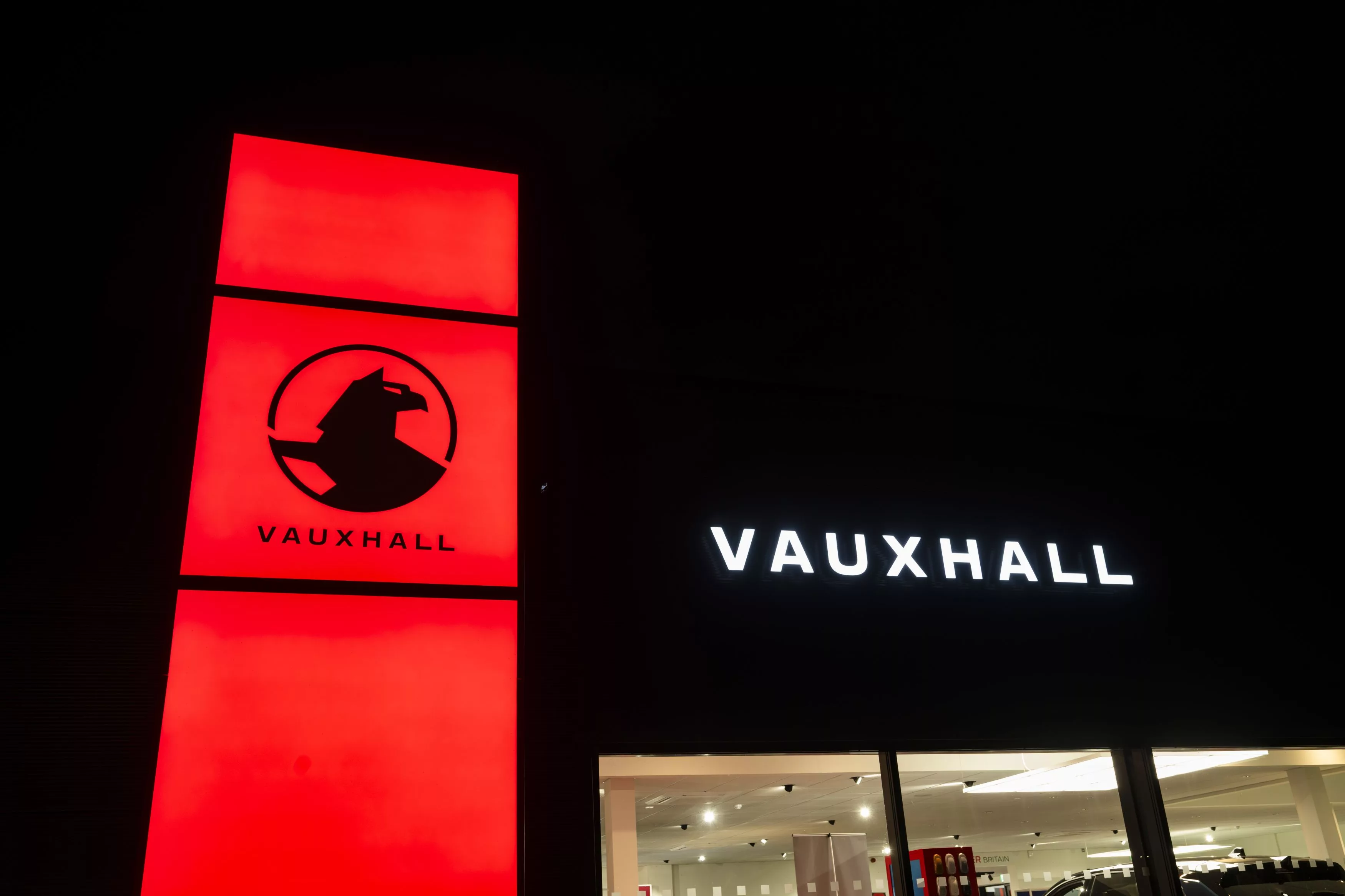
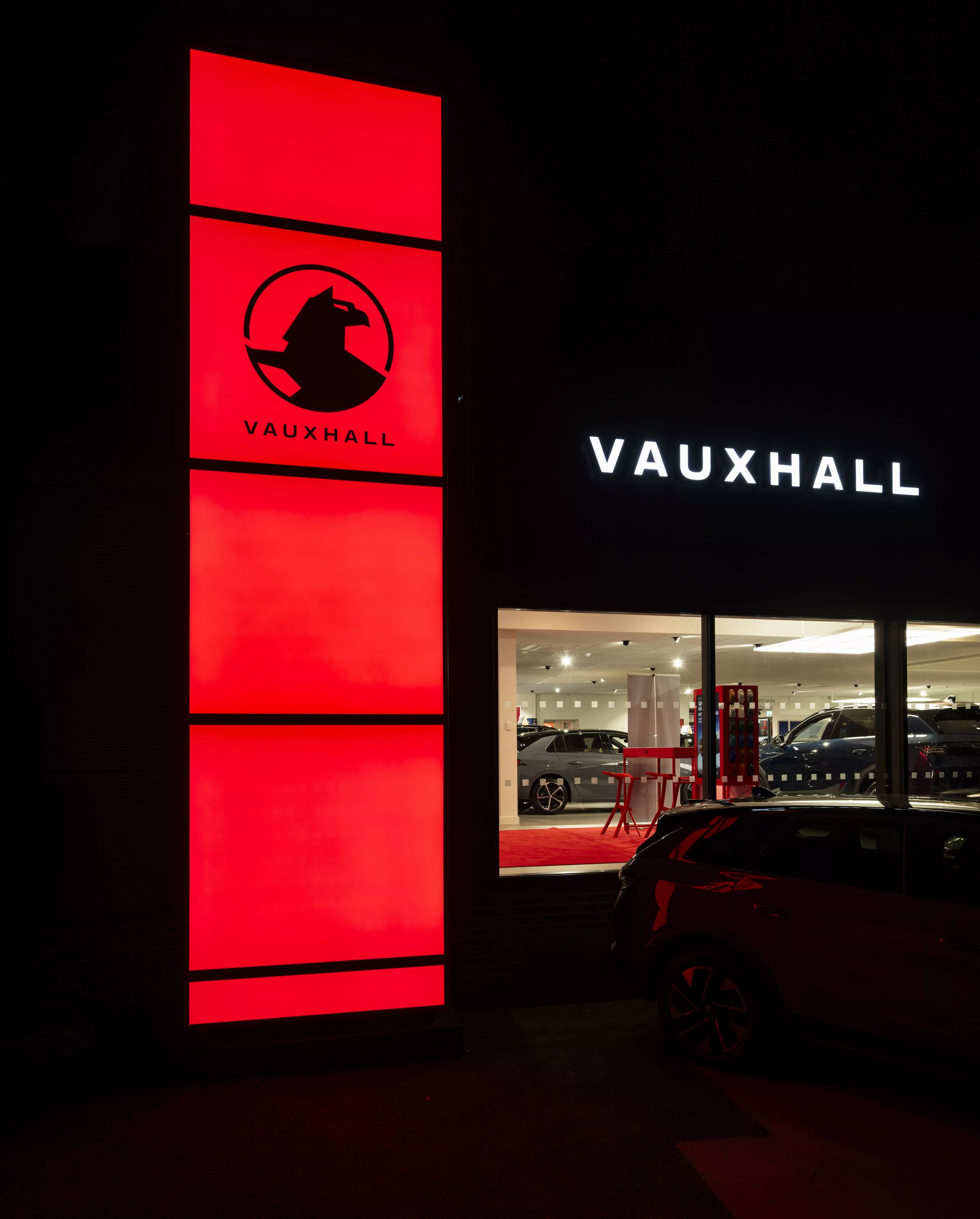
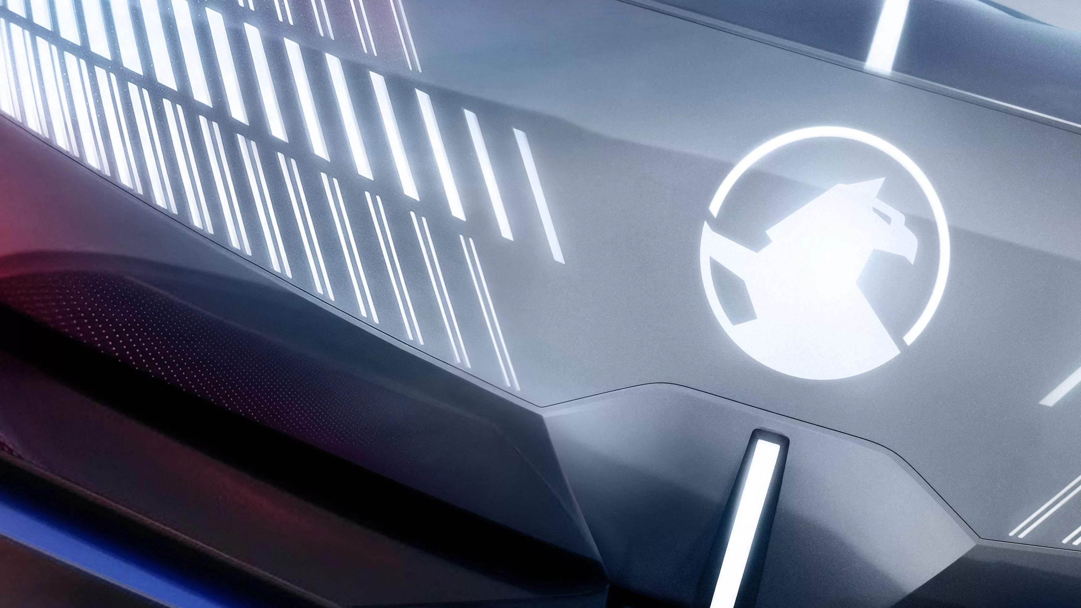
Vauxhall has updated its griffin logo, simplifying it and making it better suited to digital use. At first glance, the change is small, but the new emblem offers the first hint of the next design phase for Opel’s British sister brand.
Vauxhall says the logo retains the familiar griffin but drops some of its previous detail. The design becomes flatter and more geometric, with more prominent use of the brand’s signature red. The new identity will gradually roll out across Vauxhall’s digital channels, marketing and dealerships.
The new badge will reach cars later
The logo change does not mean that the current Corsa, Astra, Mokka or Grandland will immediately receive the new emblem. Vauxhall will introduce the badge on its cars with future models and model updates.
For Stellantis, this is a fairly inexpensive way to strengthen Vauxhall’s identity. In technical terms, the British brand shares most of its model range with Opel, so Vauxhall must distinguish itself primarily through design, history and marketing.
The new badge follows the same principle. Vauxhall’s griffin comes from the company’s roots, and its history dates back to 1857. Over the past century and a half, the logo has been simplified repeatedly, but its core element has survived.
Opel provides the technology, Vauxhall the identity
From a European perspective, Vauxhall is an unusual brand. It is essentially Opel adapted for the UK market: Vauxhall’s Corsa, Astra and Grandland correspond to Opel’s Corsa, Astra and Grandland. Both brands use the same Stellantis platforms and powertrains.
The new logo is therefore not significant news in technical terms. Strategically, however, it signals that Stellantis does not intend to discard the Vauxhall name after Vauxhall was linked with Opel.
The griffin remains. It has simply lost a few feathers.


